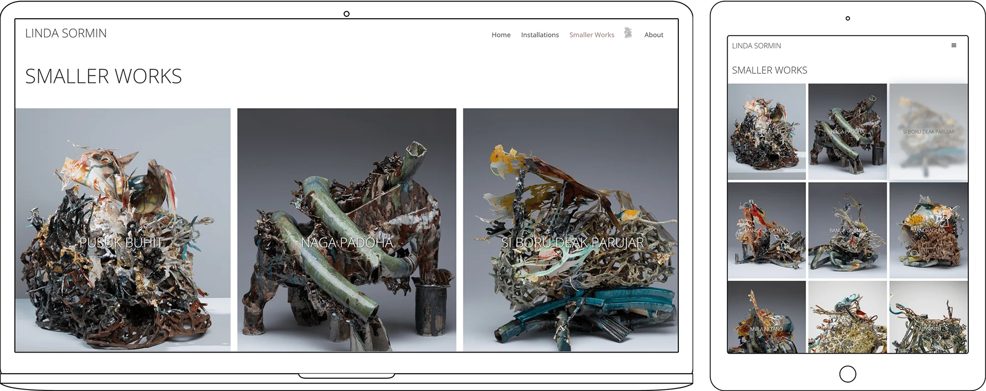
finished website
.webp)
.webp)
.webp)
.webp)
.webp)
.webp)
.webp)
.webp)
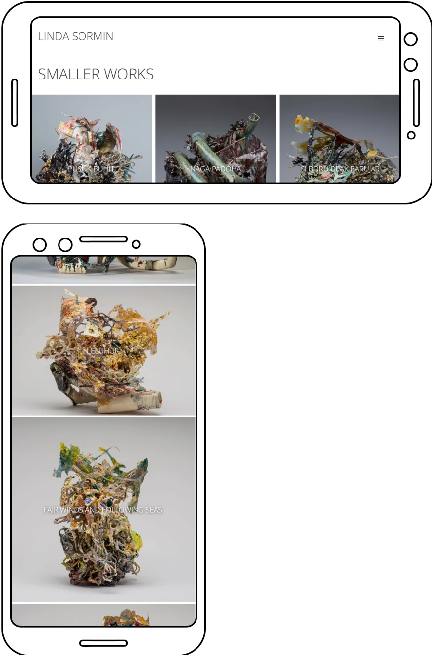
Linda Sormin, an award winning and museum exhibiting ceramicist, hired me to redesign her website. Her old wordpress website was out-dated, hard to navigate, and overall did a poor job of highlighting her unique and talented work. Through our discussions and iterative prototyping in Figma, I delivered a finished website in Webflow that showcased her work and was responsive and easy to use across all devices.
Figma
After Effects
Webflow
UX Designer
UX UI Developer
1 Month
a portrait of the artist, Linda Sormin
I started by analyzing the client's old website to identify areas of improvement and parts that would benefit from being redesigned. The client wanted to retain as much of the design language and feel of the old website as possible. These are a few screenshots from the old website.


The previous website severely cropped the content of the site to the middle of the screen in an attempt to make it work on mobile devices. The result is a website whose content does not scale well across multiple breakpoints and is illegible across all screen sizes. This, along with the need to optimize the content for the web and change the overall site navigation, determined the design criteria for the redesign going forward.


After finishing the website; the wireframes, assets, and Webflow project were all transferred to the client for their studio assistants to manage. One thing I would have liked to do differently is convince my client to keep me on as a developer and to use Webflow’s CMS system for changing and adding new content to her website. In lieu of that, another alternative would have been to create clear documentation and design guidelines, as well as instructions on how to add new content to the site in a manner that synergized with my redesign. This would have ensured that any future additions or revisions made by other designers were cohesive and on brand with the artist's other work.